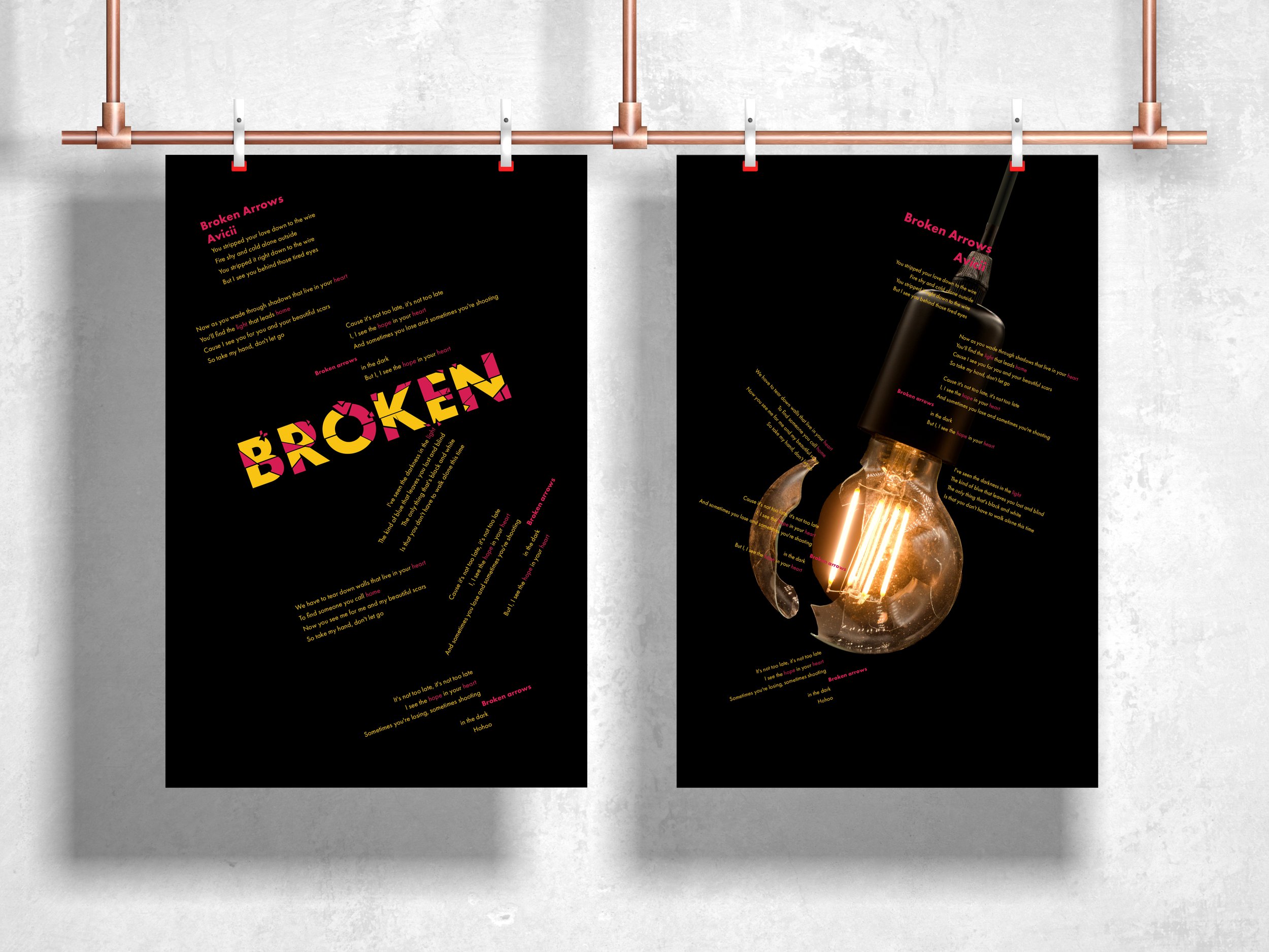
Music Broadside
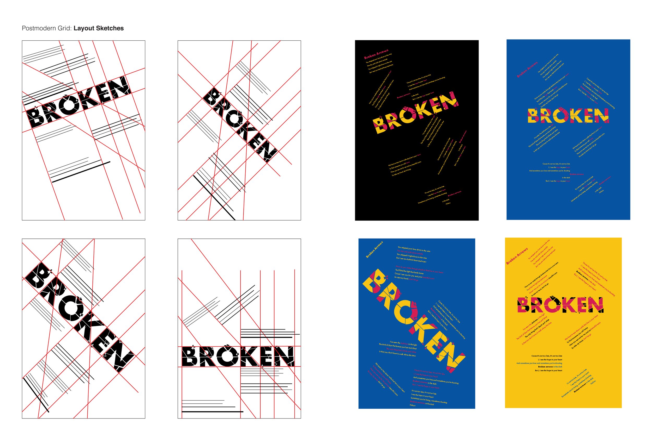
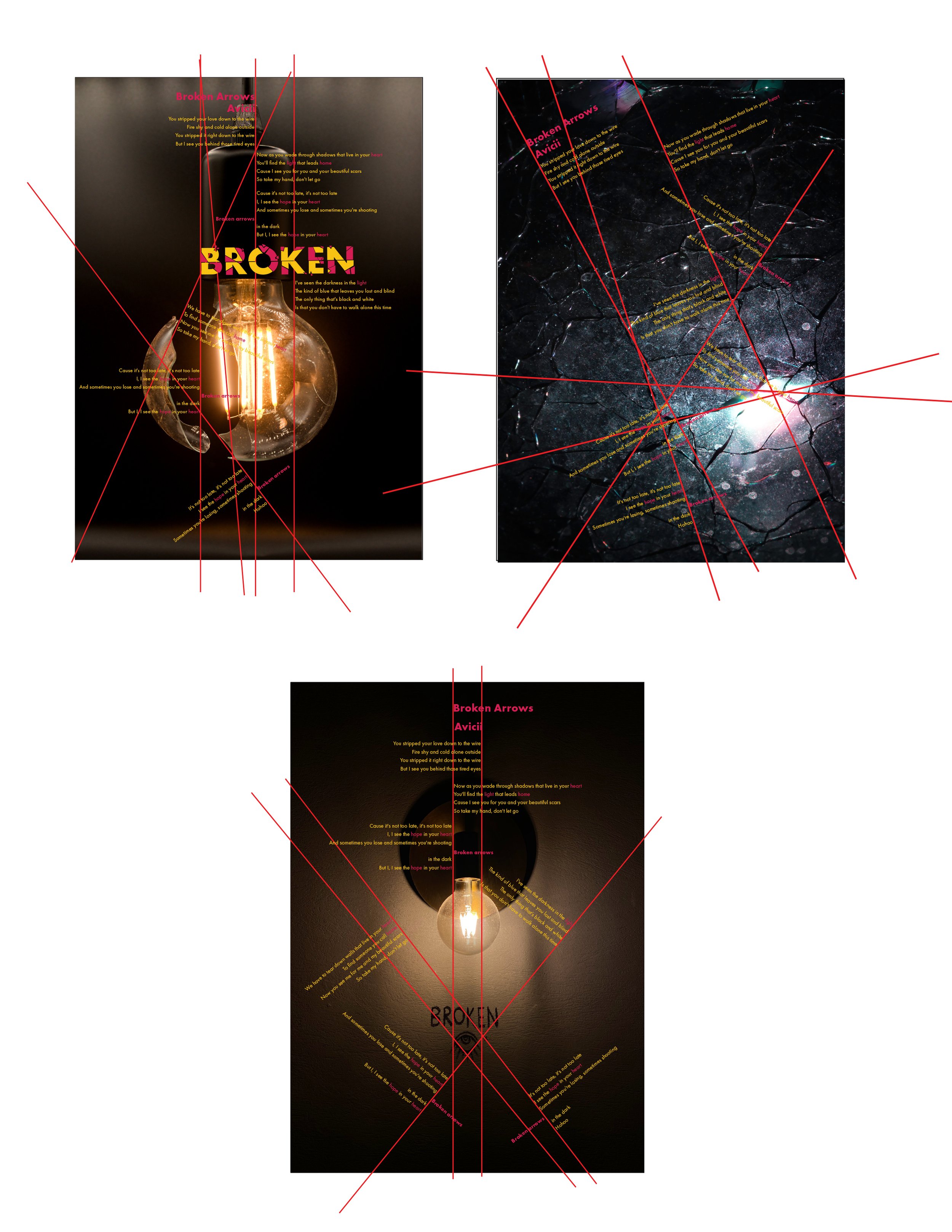
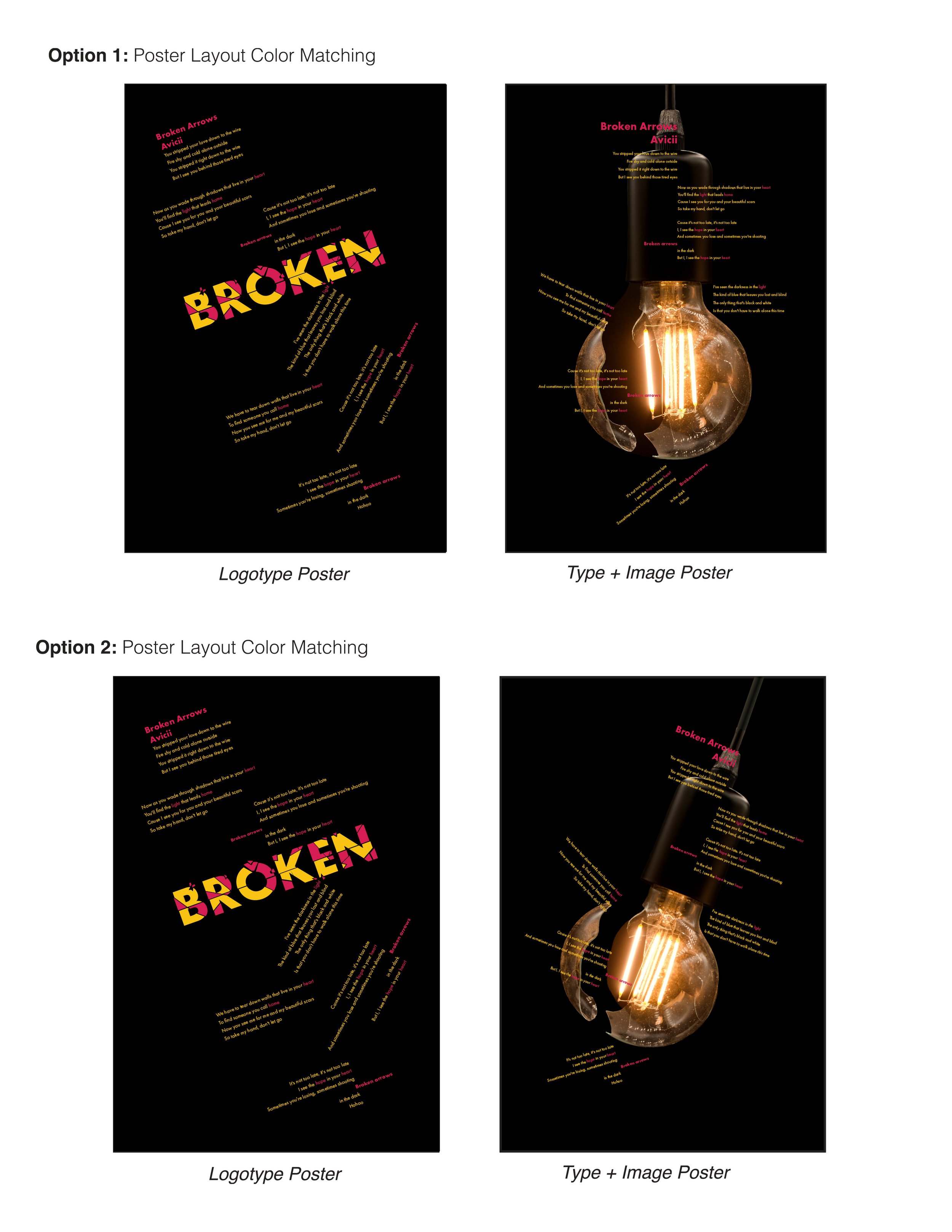
The intention for this design is to create two posters using song lyrics as the subject. The Logotype has been designed thinking of the lyrics from a meaningful perspective that addresses the story behind the song. The color Palette represents the emotions projected by the song after analyzing and researching it. The posters have a Post Modern Grid System that is based on the logotype and the other one based on the image.
Logotype Exploration and Refinement
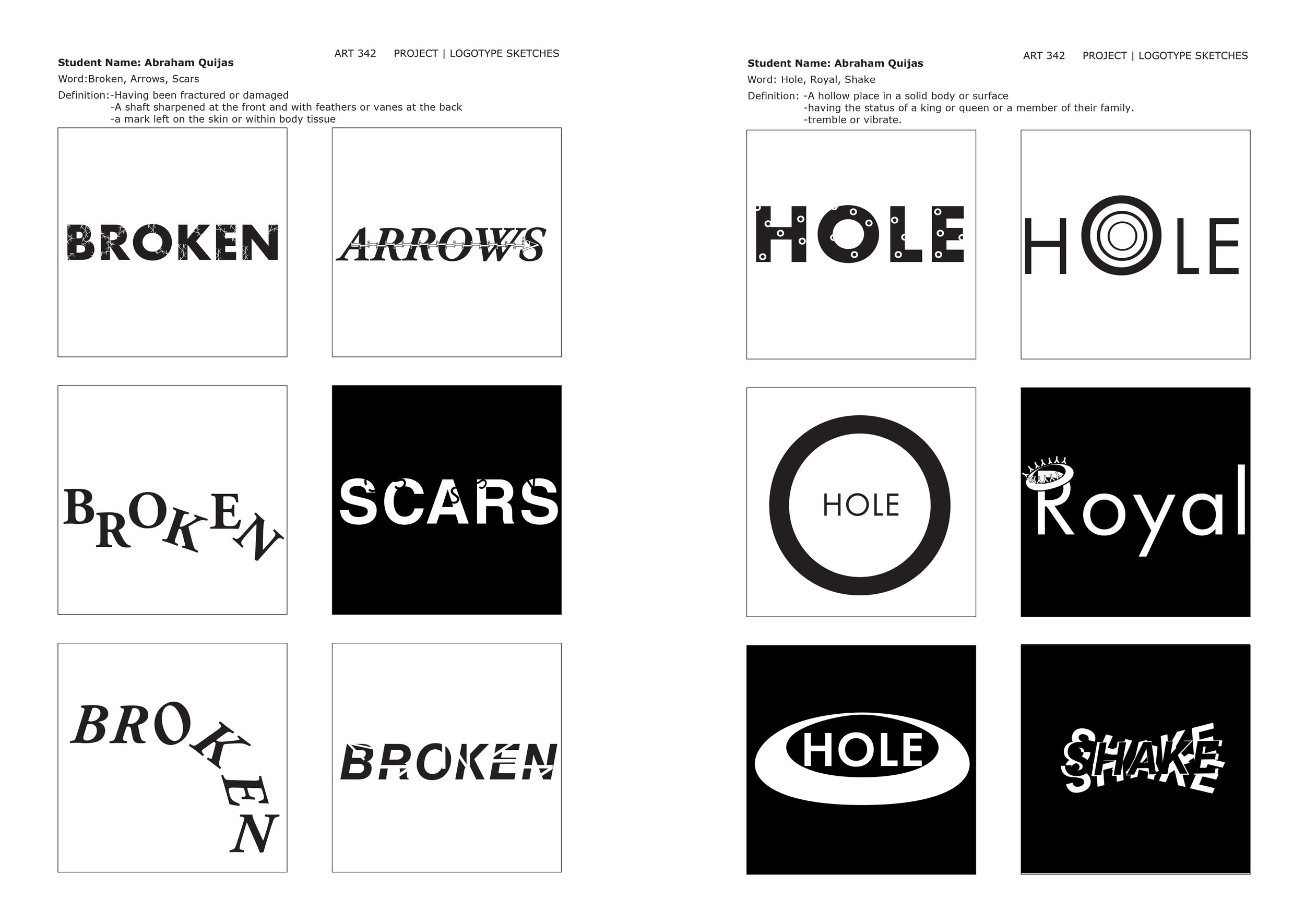
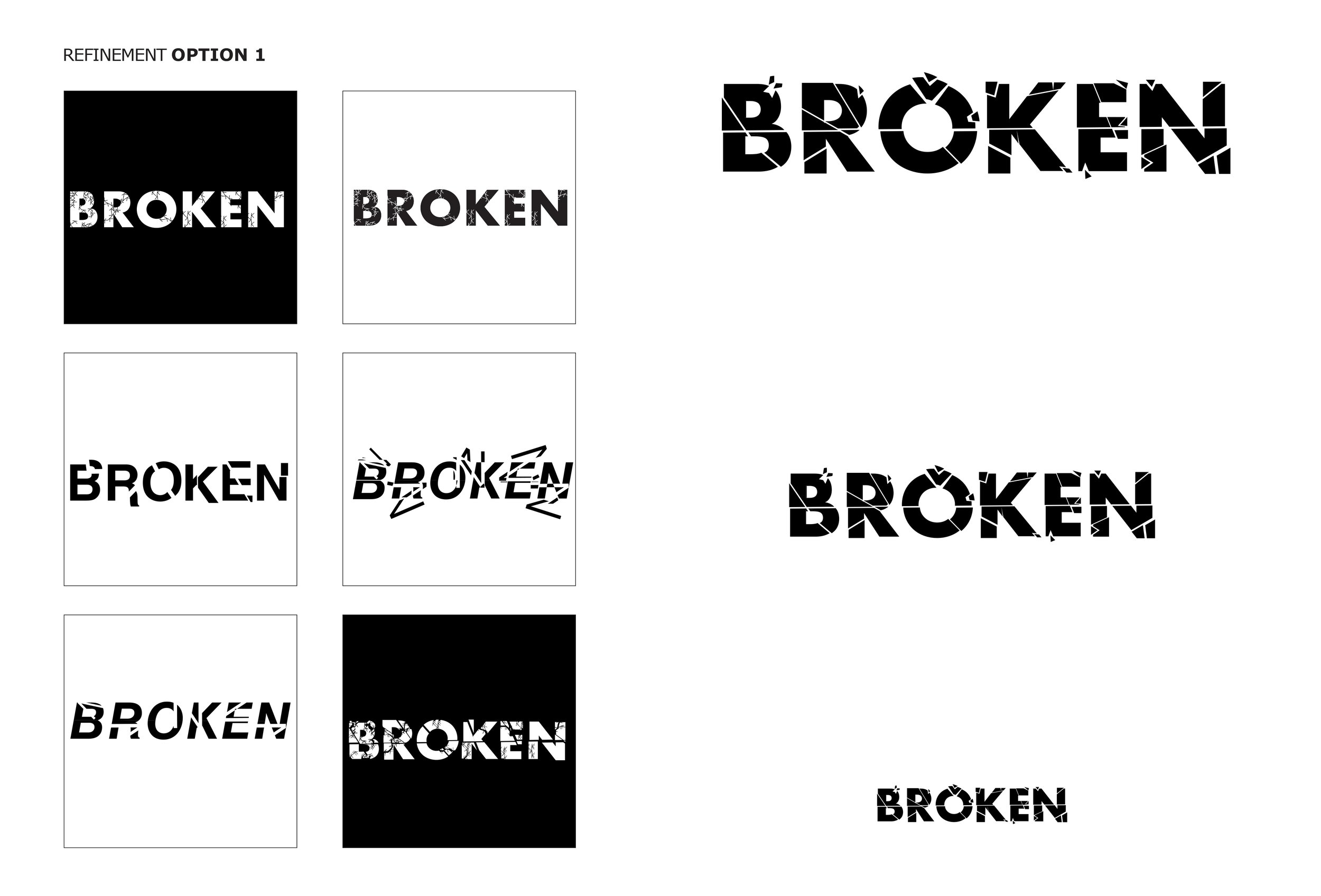
After defining the possible words for the logotype, I explored different designs for each word. Ultimately, the word "Broken" has been selected as the best option for the logotype. After refinements, I developed a logotype that expresses the word's meaning and works excellently for the poster.
Inspiration and Color Palette
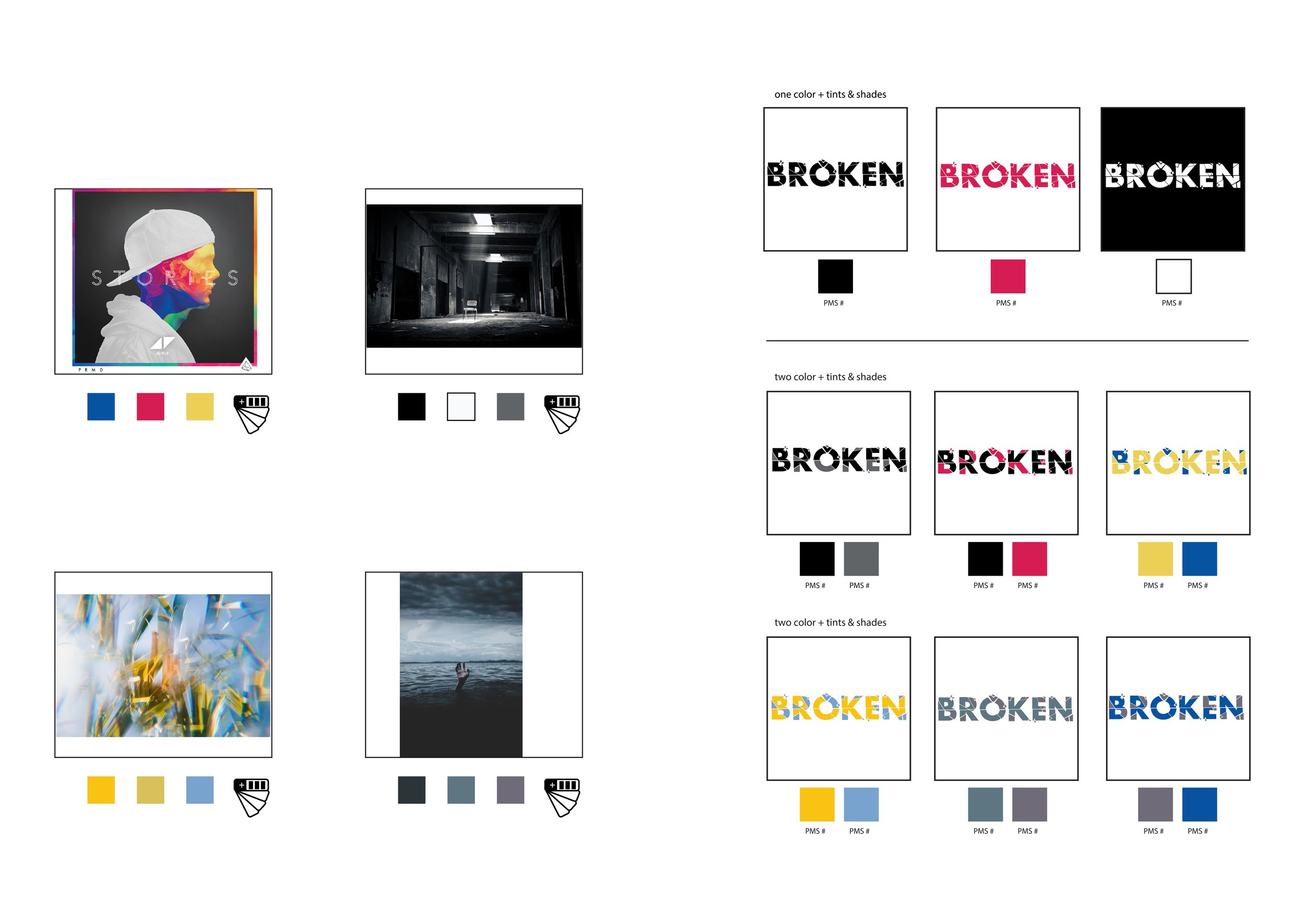
Image exploration helped to find the right color palette that communicates the song's meaning. Also, the colors such as yellow, red, and black help me communicate the song's emotions to the audience. The black has been selected to be associated with the father and alcoholism problems. The yellow color is the daughter is defined as the light that gives his father hope to be a good man again. Finally, red is used to communicate the father and daughter's love.
